
The 2020 US election is finally over, and all the election excitement of the last week reminded me of something I had been meaning to look into: Sergey Shpilkin’s data visualizations that clearly show fraud in Russian elections.
I generated the same visualizations for all US presidential elections from 2000 to 2016. The result is that I can’t find any evidence of fraud in any of those elections. But the visualizations show clear evidence of voter suppression of democrat voters. On closer inspection that turns out to be the effects of the electoral college system, which leads to a very interesting conclusion: You might already know that if the president was elected by popular vote, the US would only have had four years of republican presidencies from 1992 to 2024, with the rest being democrat. But these visualizations suggest that just looking at the popular vote actually underestimates the distortion of the electoral college. It also acts akin to voter suppression of democrats, without which national politics would swing even stronger to the left than the popular vote suggests. But lets start by looking at Sergey Shpilkin’s work:
His core idea was to plot voting results by turnout. Here is what one of his plots looks like, for the 2018 Russian election:
2018 Russian presidential election
Graph taken from this video.
Lets go over what this means, because we’ll be looking at a few of these graphs. On the X-axis we have voter turnout, on Y-axis number of votes. The peak is close to 60%, this means that most precincts in Russia had a voter turnout of roughly 60%, and most votes fell in those precincts.
Plotting this correlation, you would expect it to be roughly look like a bell-curve. (I know it’s not a “bell-curve”, but my statistics knowledge isn’t good enough to name the actual distribution that this should follow, and lots of curves look roughly like a bell…) Meaning we’d expect it to concentrate in the middle, then flatten out to the left and right. But something weird happens on the right:
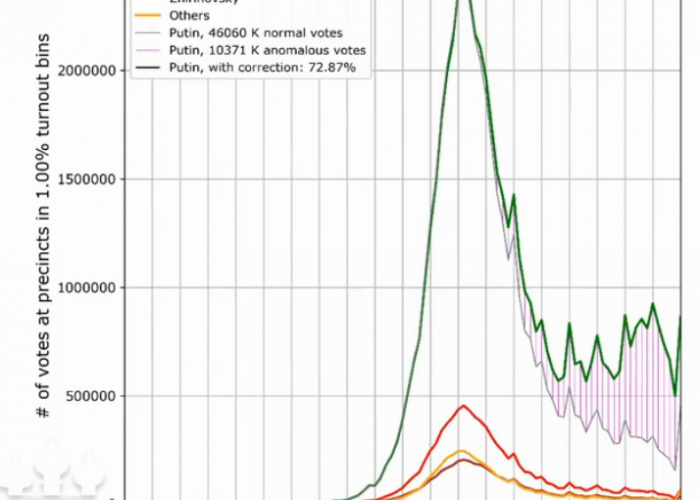
On the right side of the graph the number of votes doesn’t go down. It’s weird to see so many votes cast in precincts that have 95% or even 100% voter turnout. It’s completely unrealistic that millions of voters would live in precincts where every single person votes. Sure, if a precinct had only 100 people living in it, you could conceivably imagine that they somehow get organized so that everyone votes, but the Y-axis is far too high.
Also those people are voting for Putin a lot more than the people in the middle did. The shaded red area is the amount that these are voting more for Putin than in the middle. Meaning even if we were to believe that some precinct achieved 95% voter turnout, the shaded red region tells us that Putin received a higher percentage of the vote than we’d expect based on the middle section of the graph.
We also see suspicious peaks around round numbers: 80% and 85% have peaks, which suggests that the government isn’t even trying to cover its tracks. They just decided that they’d get a nice round number of 85% voter turnout, and then doctored the numbers to look like that.
The peaks at round numbers make the fraud super obvious, but even without them we could have concluded fraud here: All we need to see is that this isn’t bell-shaped, and that Putin is getting a suspicious number of votes in the odd region.
To really drive the point home, here is the result of the 2020 vote for a new Russian constitution:
For this one Putin has stopped pretending and just completely fakes the numbers. The spikes on round numbers are even more obvious now, and this no longer resembles anything that would look like a bell shape.
A second plot that Shpilkin likes to use is to do a scatter plot of turnout vs percentage of votes. Meaning instead of the absolute number of votes as above, plot the percentage that voted yes. Here is what that looks like for the same election:
This is a screenshot taken from the same video I linked above. That’s Sergey Shpilkin up in the corner, in the process of giving a presentation about these graphs, because I literally can not find these graphs anywhere else on the Internet…
So what do we see here? This scatter plot is supposed to show a perfectly round blob shape. Instead we see a red tail going off to the top-right, and a blue tail going down to the bottom-right. This means that as turnout gets higher, more people are voting for “yes” and fewer people are voting for “no”. This shows the same thing as the red-shaded area in the previous plot: Even if you did believe the crazy high turnout numbers, it’s still suspicious that all those people with the higher turnout decide to vote for Putin.
Another thing we can see here (unfortunately it’s blurry because I had to take a screenshot from a video) is a checkerboard-pattern in the right-most area, where the dots align to the grid. This again shows that the numbers are fake, aligning too well to round numbers.
US Elections
I’ve kept you waiting long enough. Here is that last graph, but for the 2016 US presidential election:
This looks as close to a blob shape as you can expect. I spot-checked a few of the outliers, but they’re mostly tiny counties with a thousand people living in them. And they’re not even in swing states. For example the dots all the way on the right are Mineral County in Colorado, population 769.
One clarification: The turnout number at the bottom is slightly wrong: You’d think that you can easily get these statistics for past elections, but I can’t find the turnout number anywhere. Instead I was able to get the population of the counties, so this is the number of votes divided by the population. Normally you would only use the part of the population that’s old enough to vote, but I think this shouldn’t introduce too much bias.
If you’re wondering why most counties have more red votes than blue votes, even though the democrats won the popular vote in 2016: The answer is that there are an awful lot of small counties. And a lot of those have their red dot higher on this plot than their blue dot.
To get a feeling for the absolute numbers, lets look at the other plot, with the total number of votes:
This looks close to what you’d want this graph to look like: No county has suspiciously high turnout, and the high turnout counties don’t trend towards either party. Meaning once again no evidence of fraud here.
But the left side looks odd: Why are there so many democratic votes in counties with low turnout? This is exactly what voter suppression would look like on a graph like this: If you don’t want the democrats to win, you’d somehow make sure that all of their counties have low turnout. For example by having too few polling places. Or by preventing people from voting in other ways. (like “accidentally” removing them from the list of registered voters)
Or is this just an effect of the 2016 election? Republicans did have unusually high turnout because they got excited about Trump. That explains this partially, (it’ll be clearer once I smooth this graph, further down) but it doesn’t explain why we have these large spikes on the left.
Looking into it, the biggest spike on the left, at 0.32, is mostly caused by Los Angeles in California, with 2.4 million votes for democrats. The bucket to its left, at 0.3, has as its biggest democrat contributor Brooklyn, NY, with more than 640k votes for democrats, then two other California counties with ~350k votes each for democrats, and then San Antonio, Texas with 320k votes for democrats. And the bucket to its left, at 0.28, is mostly caused by Houston, Texas (700k votes for democrats), Queens, NY (510k) and Dallas, Texas (460k).
So why don’t these people vote more? Because of the electoral college. Lets say Los Angeles really gets its act together and increases its voter turnout by 50%, to 0.48, so they would contribute 3.6 million votes for democrats. It wouldn’t make any difference to the election at all. Literally zero. Once California has been called for democrats, any additional votes are ignored. So the people in California aren’t stupid. They know how much they have to vote to make their party win, and they don’t put in any extra effort to encourage people to vote more. It would just be wasted effort.
The Texas counties suffer from the opposite problem: Texas always goes to republicans. So people are discouraged because it feels like no matter how much they vote, their vote doesn’t matter because once Texas has been called for republicans, all the democrat votes are ignored. But the situation is different here: If Texas cities had really high voter turnout, Texas would look a lot better for democrats. Currently democrats in Texas are still discouraged because historically their vote has been tossed out, but the state is slowly moving to the left, and if democrats can mobilize the cities, Texas might turn into a swing state soon. (I know they’ve been saying that for years, but the above graph is more evidence for it)
But I want to highlight how this explains one of the biggest weirdnesses about US politics for me:
The Missing Left in US Politics
As a German, US politics has always felt oddly right-leaning. Since I’ve been paying attention to politics, the US had the following presidents: Clinton (center-right), Bush (right), Obama (center), Trump (far right) and now Biden (tbd, but historically center-right). There has never been a center-left or left-leaning government.
Americans might disagree about these categories with me, but let me give you my context from German politics. Angela Merkel, the German chancellor, is generally perceived to be center-right. To contrast that, let me list some of Angela Merkel’s accomplishments:
- In the 2008 financial crisis (and now again) the government paid part of workers’ wages to save jobs (Kurzarbeit)
- She stopped mandatory military service
- Germany is getting out of nuclear power by 2022
- Germany is getting out of coal power by 2038
- She ran a balanced budget
- Legalized gay marriage
- Accepted a large number of refugees from war-torn Syria
- Cut taxes (Solidaritätszuschlag) for the working class and middle class, while keeping them in place for the upper class
If you did one of these things in the US, you would be considered a progressive leftist. Doing all of them would make you a radical. In Germany she is still considered center-right. (to be fair, she also did plenty of things that would be considered right-of-center in the US, but the point is that you couldn’t imagine republicans in the US doing any of the above)
As far as I can tell the categories are similar in most of Europe. For example no right-leaning party in Europe would argue for the same healthcare system that we have in the US. They would all argue for universal healthcare. It’s only in the US that everything is shifted further to the right, so that not even a “center” president like Obama could make universal healthcare happen.
This has always been a puzzle to me, because Americans don’t seem that different from Europeans. The above graph is the first satisfying explanation that I have seen: The electoral college distorts things far more than I thought. Yes, if the popular vote decided, the last 30 years would have been democratic rule, but even that underestimates the effect. Because without the electoral college, places like Los Angeles and New York would actually vote more. Then the popular vote would shift even further in favor of democrats. The USA would become a lot more normal, more like European countries.
And I don’t even think it would be bad for republicans. I live in New York City, and I was curious about the republican that was running in my neighborhood. After watching a video of him speak, he seemed like a perfectly nice guy, but he had no chance at all. To be a republican meant being aligned with Trump. But if national politics shifted further to the left, republicans would also shift into the mainstream, and they would suddenly have a chance in the cities again. Until then they’re being held hostage by the distorted results of the electoral college, and can’t move to more popular positions, and all the republicans running in cities have no chance.
Past Elections
For completeness, I generated that last graph for all US elections going back to 2000. Mainly because it was easy to find numbers for those. (except for the turnout number, so they all have the same distortion of using total population to calculate turnout)
That being said, when the graphs were spiky like above, it was hard to see trends between the different years. So I decided to smooth them further. Here is what that looks like for that last graph, from 2016:
Yes, this smoothed version is less informative, but it is easier to compare between years. Here is 2012:
It’s clear that the democrats won this one. And not just the popular vote, as in 2016. You almost don’t see the disproportionate number of democrats in low-turnout counties. You can also compare this one to 2016 to see how Trump increased voter turnout.
Here is 2008:
Main conclusion: Obama sure was popular the first time around.
Here is 2004:
Once again when the democrats lose, the oddity on the left side of the graph stands out more, even if it’s smoothed out here. (compare to how there is no oddity on the right side)
Finally, 2000:
And there you go, once again a plot that looks an awful lot like voter suppression of democrats.
Conclusion
The first conclusion has to be that I found no evidence of fraud in any of these elections. If there was fraud, it can not be shown with this visualization. But I don’t suspect that there was, at least not at a large scale.
The bigger conclusion is that I finally found an explanation for myself for why the US is so odd, politically. The electoral college distorts far more than I thought. It’s not that Americans are fundamentally different than Europeans or Asians, it’s that the electoral college distorts twice: by allowing less popular candidates to win, and by acting as voter suppression, making it harder to find out who would actually be popular.
After doing this work, I decided to donate to National Popular Vote, who are making good progress in converting the country to elect the president using the popular vote.
I also donated to the Center for Election Science, who are trying to make local elections less divisive.
If you don’t like US politics and wish it was more consensus-driven, more center-aligned, and more boring, I think these are good causes to donate to.
The code and data for this blog post is uploaded here.read more
