During the protests for racial justice this past summer and over the past few years, Black Lives Matter became a movement and rallying cry, a message of optimism and hope, and a simple statement of affirmation: the lives of Black people matter as much as anyone else’s.
[Image: courtesy Tilbury House Publishers]
That message is the basis of author Shani M. King’s new children’s book Have I Ever Told you Black Lives Matter. Illustrated by Bobby C. Martin, co-founder of the New York design agency Champions Design, it’s a colorful, illuminating book that reveals just how much Black voices have shaped American history over the centuries. And Martin, whose expertise is in graphic design and branding, makes the names the visual focus of the book. He groups names by field and uses bright optical colors to add a sense of play, making it fun to find new role models in the pages.
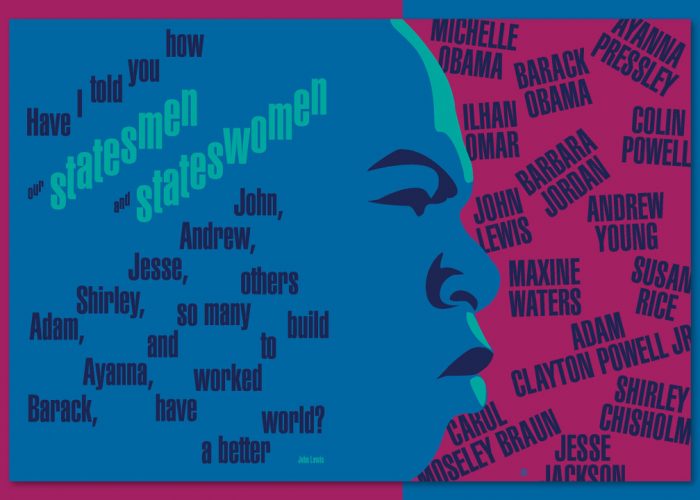
The book features 116 important figures across science, medicine, art, literature, politics, journalism, sports, entertainment, and music, offering a rich sample of the Black figures who have shaped the arc of history and culture. Kids will know some, like Sojourner Truth, Barack Obama, and Michael Jordan. Others, like playwright August Wilson or painter Jacob Lawrence, may offer new sources of inspiration. Like many children’s books, it uses repetitive language as a framework: “Have I told you that we turned folk music into jazz in New Orleans?” one page asks in white and pink type, over a sea of blue. “Have I told you that we are brilliant academics, lawyers, advocates, and judges?” another asks in type that splashes across the page, with names of luminaries in the field layered over the question in all caps. As kids read their way through the book, the type crescendos into bigger sizes. It creates rhythms across the page. It’s musical.
Bobby Martin (left) and Shani Mahari King (right). [Photos: Justin Bettman (left), Donielle Nardi (right)
It’s also meant to inspire. Here, Martin, who has done work for major organizations like the NBA, WNBA, MTV VMAs, Dartmouth, and the Girl Scouts of the USA, explains how he designed the book and why it matters.
Fast Company: How and why did you join the project?
Bobby C. Martin: One of the things that I’ve been thinking a lot about is how, as a graphic designer, we can play a role in standing up for something.
So when this book came along with this celebration of Black lives and being able to show and build value around all of the people that have made huge contributions, I thought it was an excellent way to try out some of the things that I was exploring around Black Lives Matter and some of the graphic approaches that I’ve been doing in some recent work, whether it’s the New York Times Magazine cover for the Nikole Hannah-Jones piece [about the history of economic injustice in the United States] or others where I was very much inspired by the culture around me—whether it’s the big murals on the streets or the scrawling of messages on placards and signs that people are carrying when they’re walking through the streets protesting. I thought that there might be a way to capture some of that energy and bring it into a book that is going to speak to a younger audience. That was the graphic reason around it.
The other reason is I have a 15-month-old son. So I’ve been thinking about him. I have a four-year-old niece and nephew. I’ve been thinking about them. And so being able to one, have to explain what the heck it is that I do to these kids; and then, be able to do something that actually adds value and teaches them was another big reason for taking this on.
FC: What was your visual strategy for illustrating the book?
BM: Everything I had shown them in the initial sketches was stark, strong, powerful, black, and white. I had to think more about who we’re communicating to—this younger 10-, 12-year-old audience—and about some of the work that I’ve done in the Black community.
Blackness means something different to everyone. Coming with the one approach of what Blackness is or means was not really appropriate. So I thought about this rich collection of color. Something that stands out from all the children’s books and all of the clutter that’s out there. There are fluorescent inks. There are contrast colors. I wanted to make this a celebration of color and a celebration of life, and make this a really optimistic and fun book to read. That’s why the color is so bold and so present throughout this whole publication.
FC: It seems like you had a lot of fun with type setting. The letters span across pages at different angles and there are different sizes and colors that all share the same page space. Could you talk about how you set the type? What was your goal?
BM: The medium of the illustration is the type. So being able to use typography as an illustration to tell a narrative or to evoke a certain feeling was what I really wanted to do. A project that I did for Merch Aid [an initiative that paired designers with small businesses in need due to the COVID-19 pandemic] was the beginning of me experimenting with this kind of cut paper, stretched and pulled imperfect typography that was very much inspired by the imperfect but beautifully crafted typography that we see at so many of the recent protests and movements. Each spread in this book is very different. I wanted to use the type to be able to capture the spirit of what was happening on each page; or who was being celebrated and spoken about in any spread.
I think the eclectic, more is more approach here was done to show that these aren’t just a handful of people that we’re speaking about. This is a wide volume of people that have been making a difference for a very long time. So having the ability to show this diversity of perspectives and disciplines and people and ages was something that I thought type could help communicate.
FC: Your work with Champions design typically involves building visual identity systems for adults. Did illustrating a children’s book lead to any new creative challenges?
BM: I’m not a traditional illustrator. We were able to get away with not needing to show every single person. We could use people throughout to really punctuate the story, or celebrate someone like Congressman John Lewis with a really big and bold illustration. The challenge was thinking of an illustrated book through the lens of a graphic designer and of a brand designer.
The benefit of the work that I do on a day to day basis is being able to come into any project that’s completely new and quickly learn what the project is about and who the project is for, and then deliver something that is appropriate and inspiring and innovative within those kinds of boundaries.
This is going to not only be the introduction of all these different people to young kids in elementary school, but this is also the introduction of graphic design. This is the introduction of typography. This is the introduction of color theory. I’m constantly fighting with our current national design organizations revisiting the history of graphic design. How can we really provide a platform for the future of design to not be so monolithic? This is a way to introduce graphic design to kids that are in elementary school. They’ll get this book and say, ‘Wow, I haven’t seen anything like this before. I didn’t know that you could just take language and do this stuff with it.’ These are all things that kids are already exploring because they’re exploring letter forms, writing, cut paper and art. So subtle ways—maybe my whole life is about this—it’s really setting up things for the future.
FC: What are some of your favorite pages in the book that really stand out in communicating this celebratory message?
BM: I was working on this in the summer. We had just lost Congressman John Lewis. It was fun being able to do that spread [of the congressman] because his profile is so iconic. It’s a simple profile of John Lewis with a couple of little details. That spread also includes Kamala Harris, who was at the time just becoming the official nominee for vice president. So that spread makes a very important point because it celebrates somebody who was so powerful yet, so humble and so kind. He’s not a physically big person, but he was a giant. That spread was one that I really enjoyed working on.
FC: What do you hope that the illustrations convey to readers?
BM: The thing that I want first is for readers to be interested in each page and learning about the content that the writer Shani has brought here. There are so many different people. Some are big names, like John Lewis. With others, you’re like, well, who is Jerry Pinkney? To be able to celebrate children’s book illustrators in here, to be able to celebrate scientists, to be able to celebrate sports figures and politicians: It’s different people from different backgrounds that don’t get the same amount of attention that, say, a LeBron James would get.
The most important part is being able to celebrate these people and celebrate their names. Then I think the other is to have the illustrations and the typography work together to introduce these people to the reader in a new way so it makes them want to sit down, and flip through it or save it and come back to it for more. The publisher spent a lot of time building an index of bios for all the 116 names that are in it. That provides real weight to the more expressive things that we were able to do with the illustration. This book is really fun to look at and read through, but it can also be used when you are doing homework or just learning about things that are happening in the news. You can refer to this as a reference. I love the contrast.read more
This gorgeous new children’s book celebrates Black Lives Matter