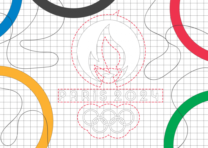
In 1913, Baron Pierre de Coubertin, the founder of the modern Olympic Games, created one of the most recognizable logos in the world. The symbolism of the five colored interlocking rings, representing the participating continents and the “flags of all nations” united in sporting endeavor, is simply conveyed and easily grasped.
A good logo communicates its message in an effective visual way and de Coubertin’s certainly achieves that. It has become the basis upon which logos for the Games are built.
With the next Summer Games in Paris in 2024, it’s worth looking at the first city to design its own Olympic logo . The 1924 Paris Games were represented by a simple line-drawn ship on a shield background with words on top that are hard to read. Legendary American graphic designer Milton Glaser, famous for his iconic “I heart NY” logo, described it as a “bad beginning.”
But Paris isn’t the only city to struggle when trying to create a memorable logo. The history of Olympic logos shows it’s not easy to strike the tricky balance between capturing the spirit of the Games and that of the host city. There have been a few cities that have got aspects of it right but there have been logos over the years that vary from the culturally uninspiring to the controversial.
Visual simplification
De Coubertin’s design first appeared on the 1920 “Antwerp flag.” But when this embodiment of noble idealism appeared at the 1936 Berlin Olympics, it was displayed alongside another of the 20th century’s most recognizable symbols: the Nazi swastika.
A simple black-and-white line design, the majority of the Berlin Games logo is taken up by a sinister-looking eagle, a common Nazi symbol, atop the Olympic rings. Buckling beneath the bird’s claws, the rings are flattened—a portent of the political oppression that was to come.
From the 1930s onwards, the growing influence of modernist “less is more” design saw the logos of the summer and winter Games increasingly adopt visual simplification.
The growth of multinational companies after the Second World War fueled a need for corporate identity schemes that could visually communicate with international, multilingual audiences. The visual clarity and abstraction of the International Typographic Style (often called the Swiss school) was well suited to the job and also adopted for global events like the Olympics.
[Image: IOC/Wiki Commons]
The logo of the previous Tokyo Games in 1964, designed by Yusaku Kamekura and Masaru Katsumi, features a red sun with gold rings and bold letters that perfectly epitomizes this minimalist style. Milton Glaser rated this Games’ logo as his favorite for the clear and simple way “the parts fit.” Kamekura’s use of striking photography in his Olympic posters is another trait of Swiss modernism and his identity scheme successfully expresses a dynamic, modernizing Japan.
For many, this system’s approach to graphic design reached its pinnacle at the 1972 Munich Olympics. Designer Otl Aicher’s logo, a radiant black and white spiral beneath the Olympic rings, is just part of a wider highly coherent design scheme. Its uniformity is achieved through a restrained color palette and a complex geometric grid format that underpinned all elements—from posters to the iconic pictographs for each sporting discipline. However, Aicher’s design, like all modernist designs, has also been criticized for being too visually neutral and not culturally symbolic enough.
Cultural identity and sport
There have been logos that have managed to incorporate their culture successfully.
The 1968 logo for the Mexico City Olympiad, for instance, is widely revered for embodying local cultural identity by combining contemporary and Mexican folk art. Through its use of repeat line patterns and bright colors, a mesmeric modern logo that could be animated for film and TV was created.
Other designs since then have tried to achieve the same iconic status by striking the right balance between cultural identity and sport.
[Image: IOC/Wiki Commons]
Designer Wolff Olins’ logo for London 2012, a fragmented collection of garishly colored jagged shapes, seemed to speak to no one. It caused huge public outcry when first released and was even derided in the design press.
Yet after Team GB did so well, winning 65 medals, the youthful, graffiti-inspired logo and creepy one-eyed mascots were reappraised as a successful attempt to break with the formulaic look of previous games. It was deemed a logo, along with director Danny Boyle’s quirky opening ceremony, that gave Britain a sense of its modern self and spoke volumes of the idiosyncratic quality of British creativity.
Asao Tokolo’s designs for the Olympic and Paralympic Tokyo 2020 logos embody the sophistication and respect for Japanese tradition in the indigo-blue, checkered pattern. More debatable is whether the message of “unity in diversity,” in the use of three varieties of rectangles, is widely understood.
[Image: IOC/Wiki Commons]
The next Summer Olympic and Paralympic Games in Paris 2024 will share a logo in an effort by the International Olympic Committee to be as inclusive as possible. But branding design experts have been less complimentary about the attempt to visually combine the gold medal, Olympic flame and Marianne (the symbol of French republicanism) into the logo. They have likened the graphic representation, which depending on how you look at it, to an oddly sexist 1920s flapper rather than a modern sportswoman.
The Olympics have come full circle in 100 years: from Paris, back to Paris. But designing a successful host city logo has not become easier. Critics of the decades-long political controversies surrounding the Games even suggest the Olympic logo now embodies other ideas, such as spiraling costs, corruption, social oppression, and environmental impact.
As such, designing an Olympic logo that successfully captures the spirit of the event, while resonating with a local and global audience, has undoubtedly become increasingly difficult.read more
Why it’s so hard to design an Olympic logo


